SHAKE SHACK
At Fuzz I was the Lead UI Designer on the Shake Shack account. My role consisted of maintaining the product ecosystem from a UI perspective, designing new features for Shake Shack’s iOS app and in-store kiosk experience, as well as creating a design system to expedite design internally.
Jump to:
Rate Your Order →
In-Shack Pickup Optimization →
Design System →
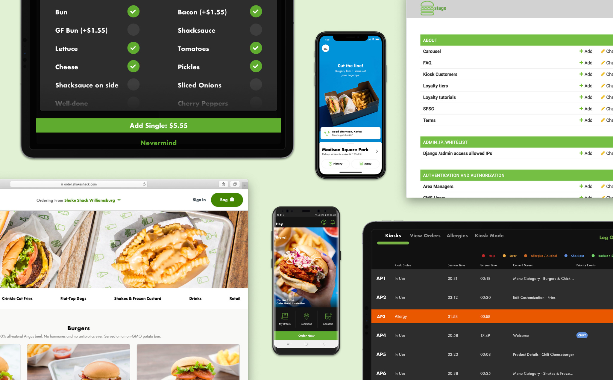
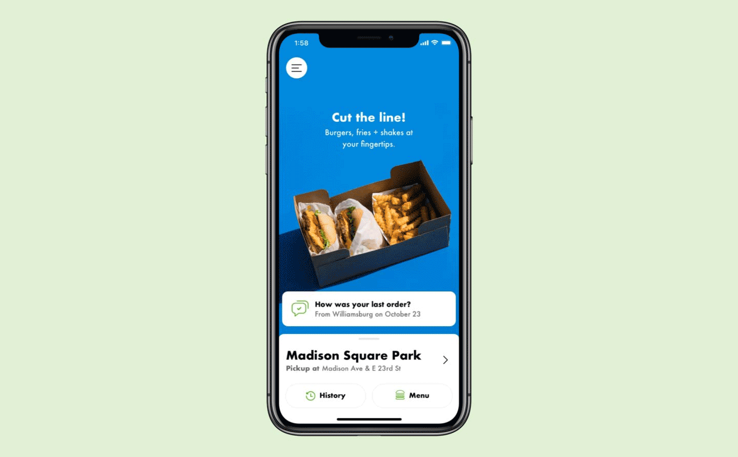
The Shake Shack ecosystem consists of two apps for iOS and Android, a in-store kiosk experience, order ahead on the web, and an admin app for employees.
Rate Your Order
The challenge: Take the current web survey experience and translate it to fit within the iOS app. Make it engaging enough so that it succeeds in collecting customer data with a low drop-off rate. The designs should fit within Shake Shack’s current design system and enhance Shake Shack’s brand of hospitality.
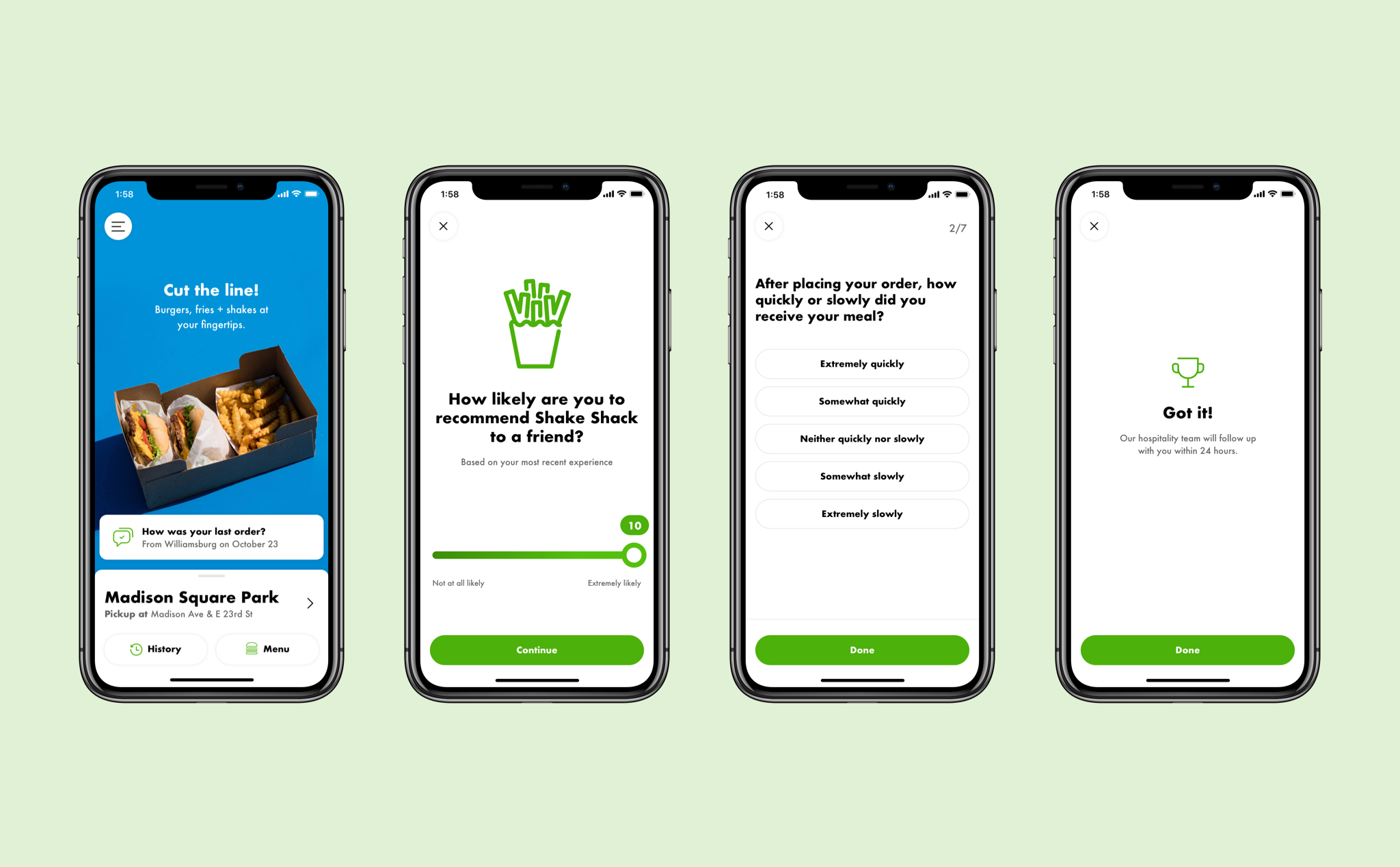
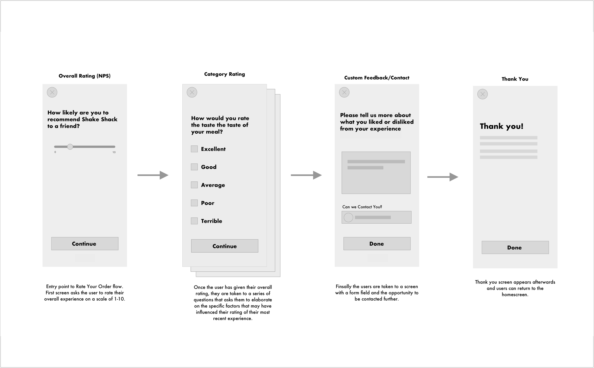
Initial wireframes for the “Rate Your Order” flow
After implementation we took a look at a couple key metrics over a 4-week time period. We found that the engagement rate was quite high, but that only about a half of users were completing the survey. After taking a deeper look we found that about a third of users were dropping off after completing the NPS rating step.
We used this data to influence our next iteration of this feature. This included exploring ways to cut back the multiple choice questions and adding incentives from the loyalty program to reward users upon survey completion.
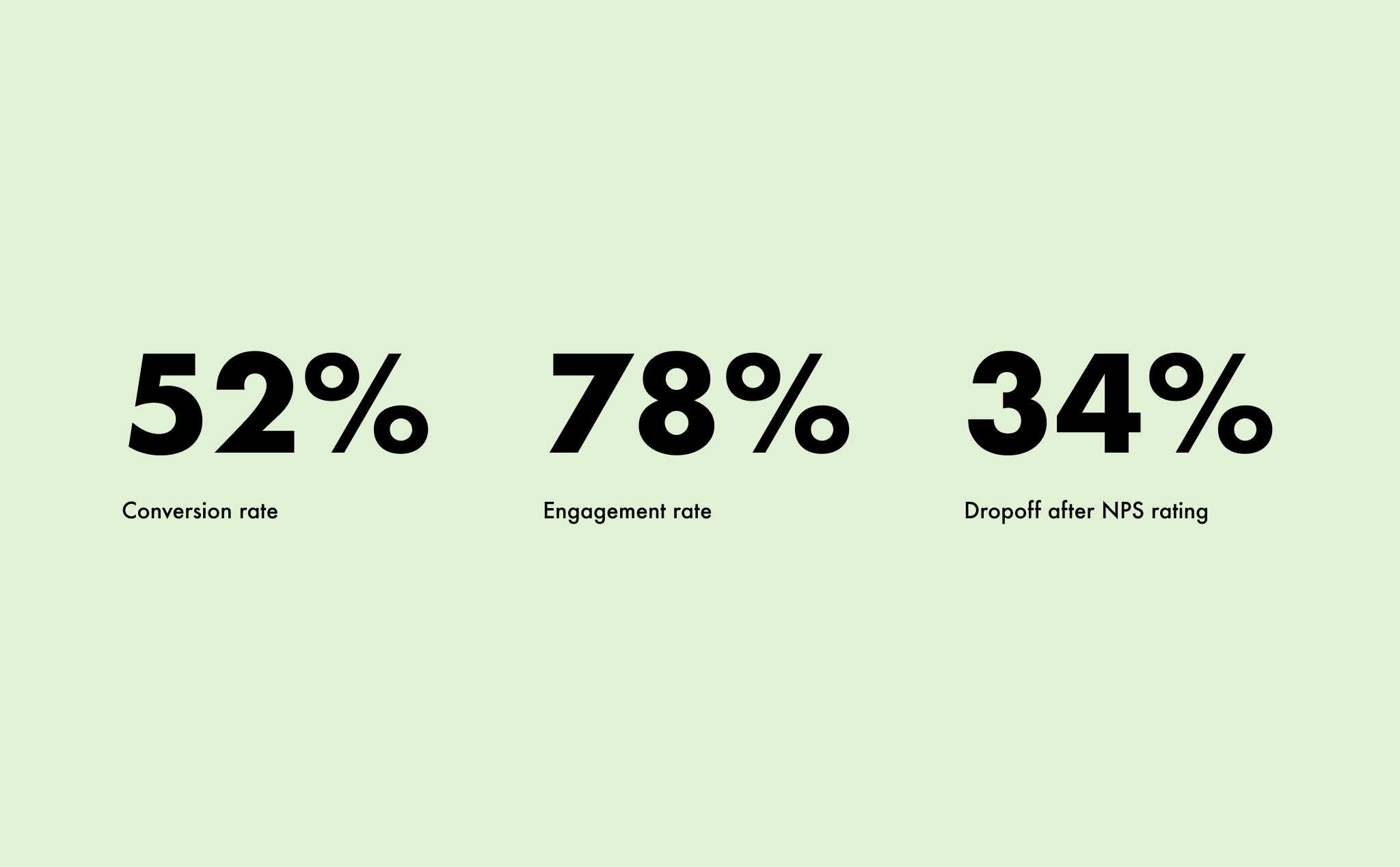
Metrics taken from 4-week time period after implementation
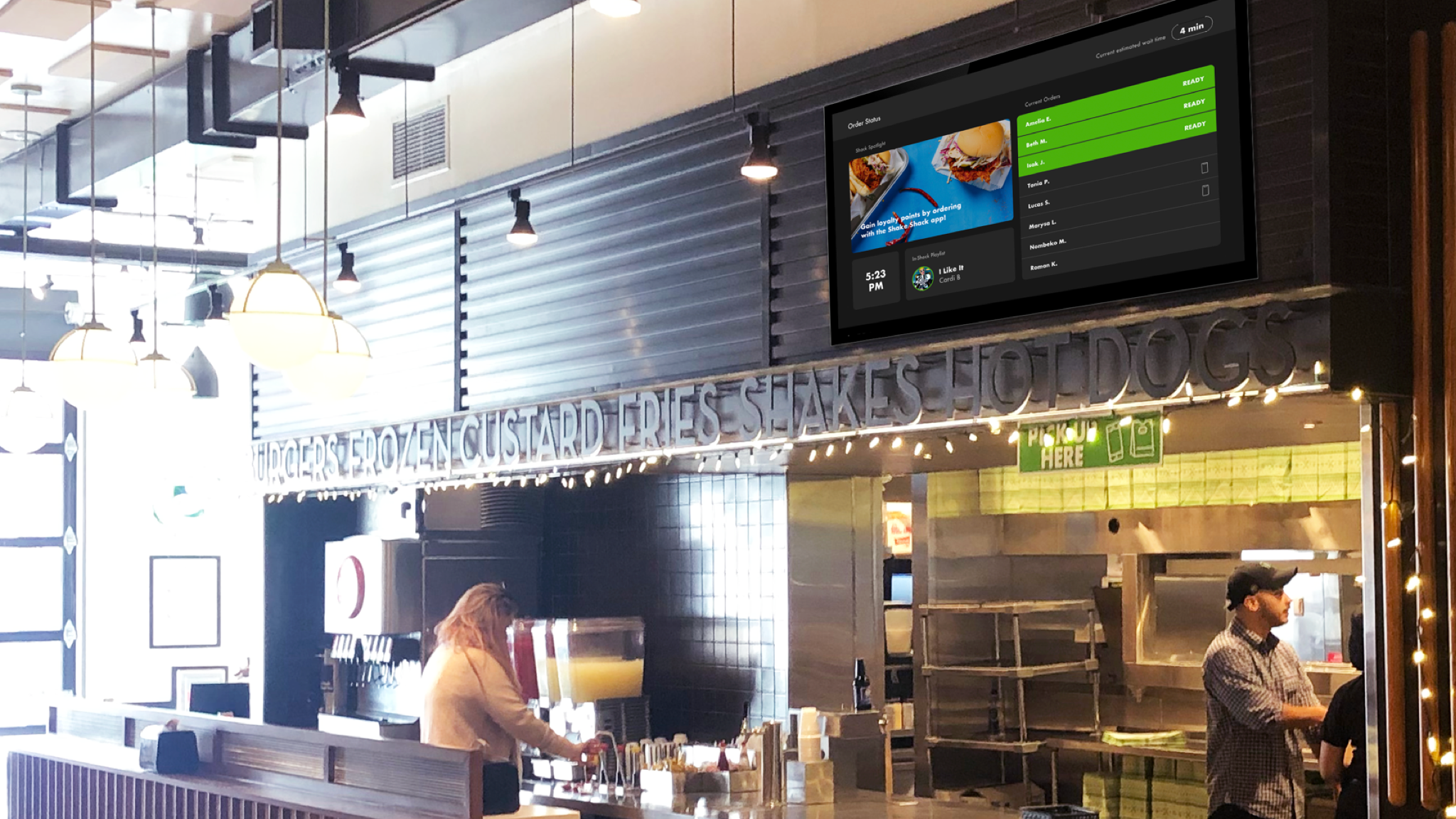
In-Shack Pickup Communications
The challenge: Explore ways to improve Shake Shack’s digital ecosystem to alleviate guests crowding at the pickup counter.
Current experience: kiosk guests, app guests, and register guests gather around the counter waiting for their order to be called.
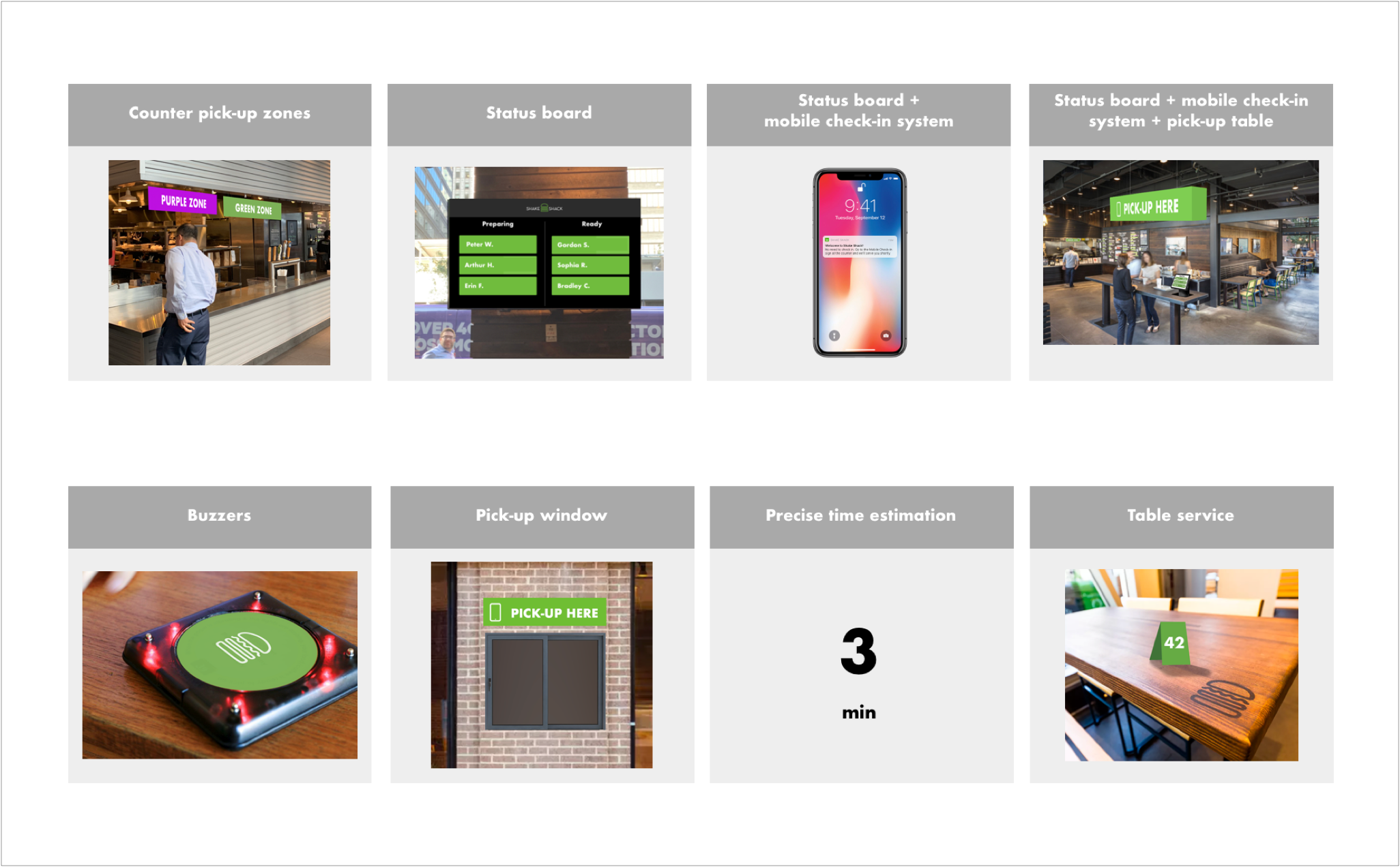
We explored many different options to help solve this pickup problem ranging from large experients to quick executions that could be tested.
Status Board Refinement
If there was a source of truth for order preparation would guests feel comfortable enough to move about the Shack instead of crowding the counter? This was a core question we wanted to answer with the status board proof of concept.
Our assumption was if the status boards were placed above the pick up counter guests will have to step away to see it. Also placing them in the seating area could prompt guests to find a table while they wait for their order.
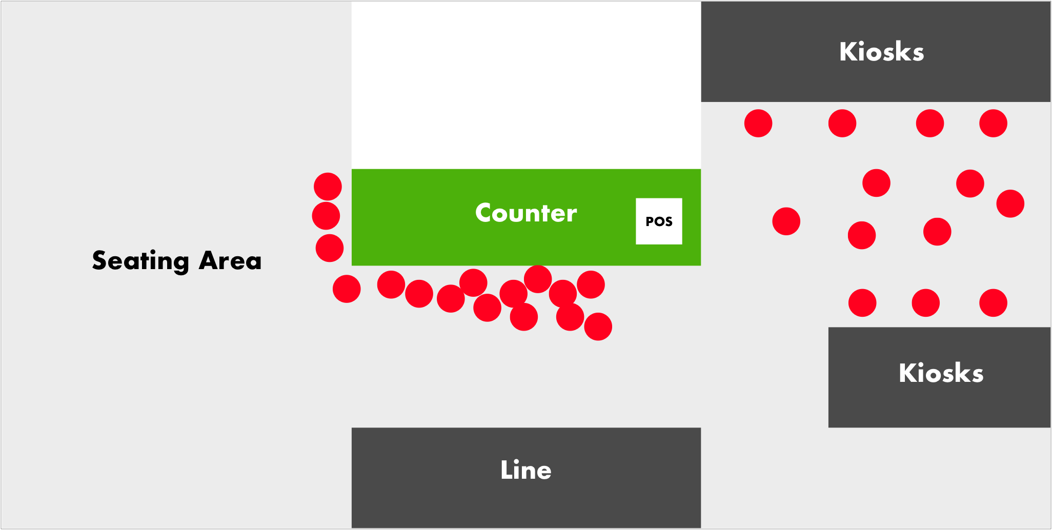
Map of Shake Shack’s Midtown East location in NYC. The red dots represent guests in the current pickup journey.
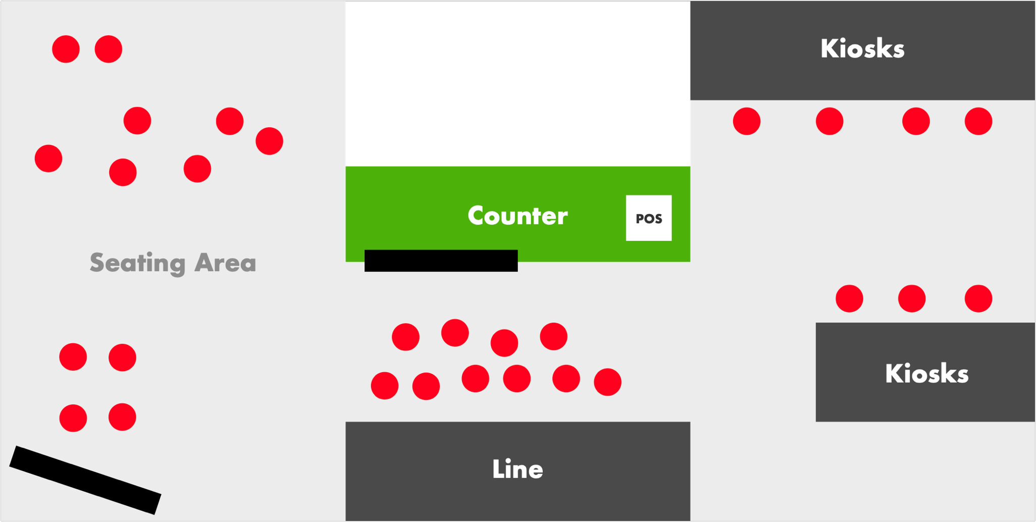
Updated map with our hypothesized changes if the status boards were implemented and strategically placed.
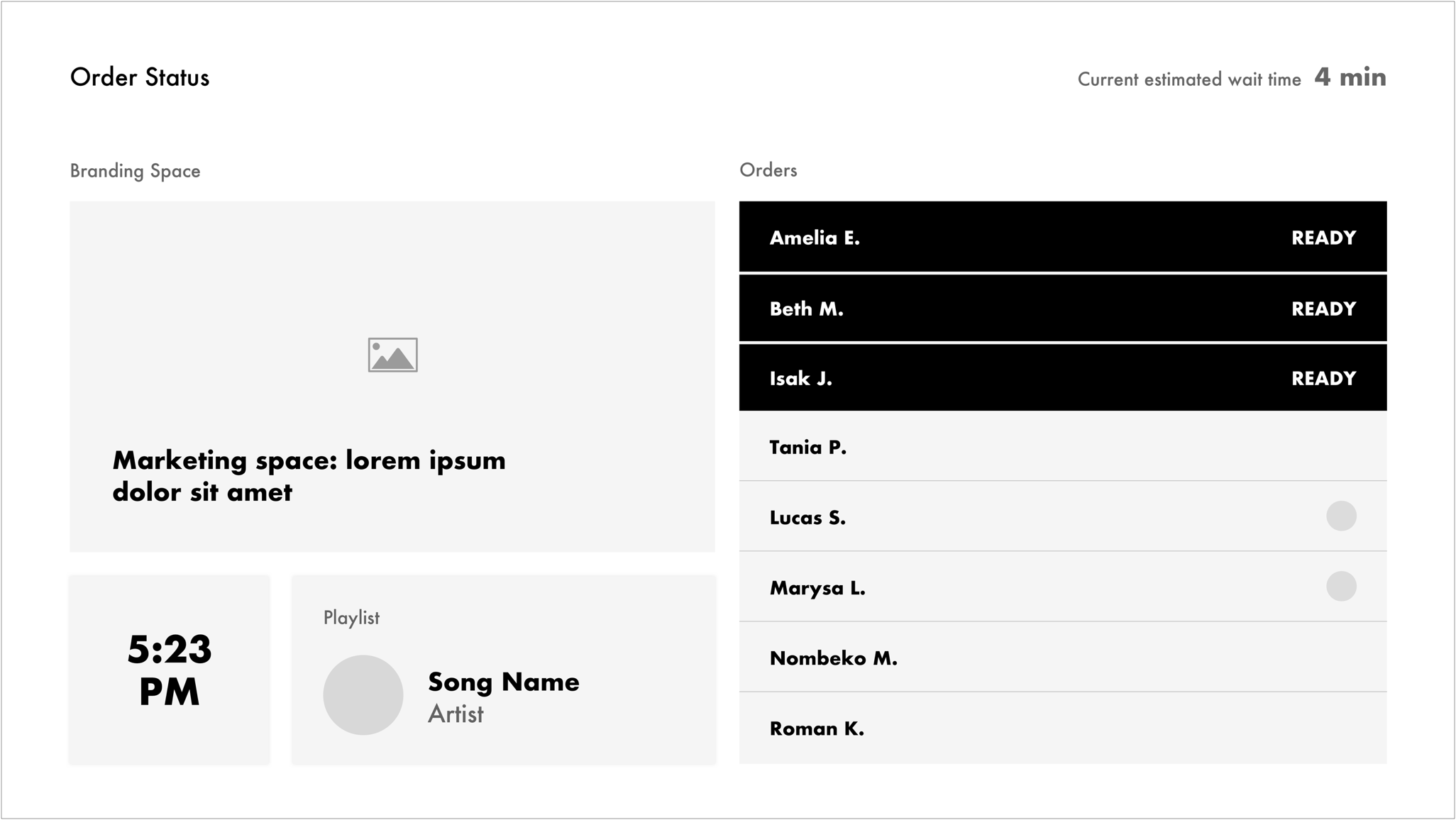
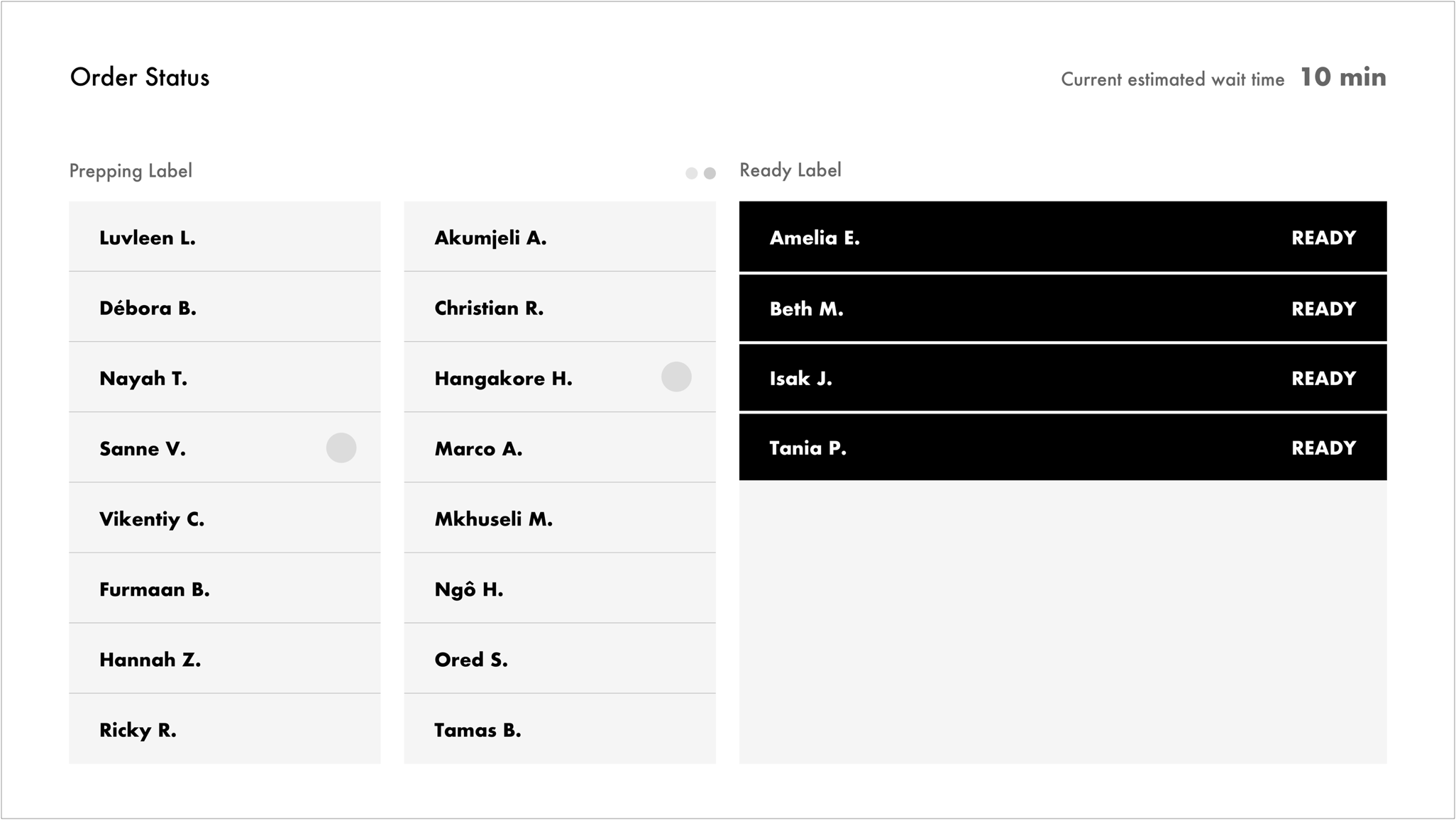
Wireframes for both regular and rush hours.

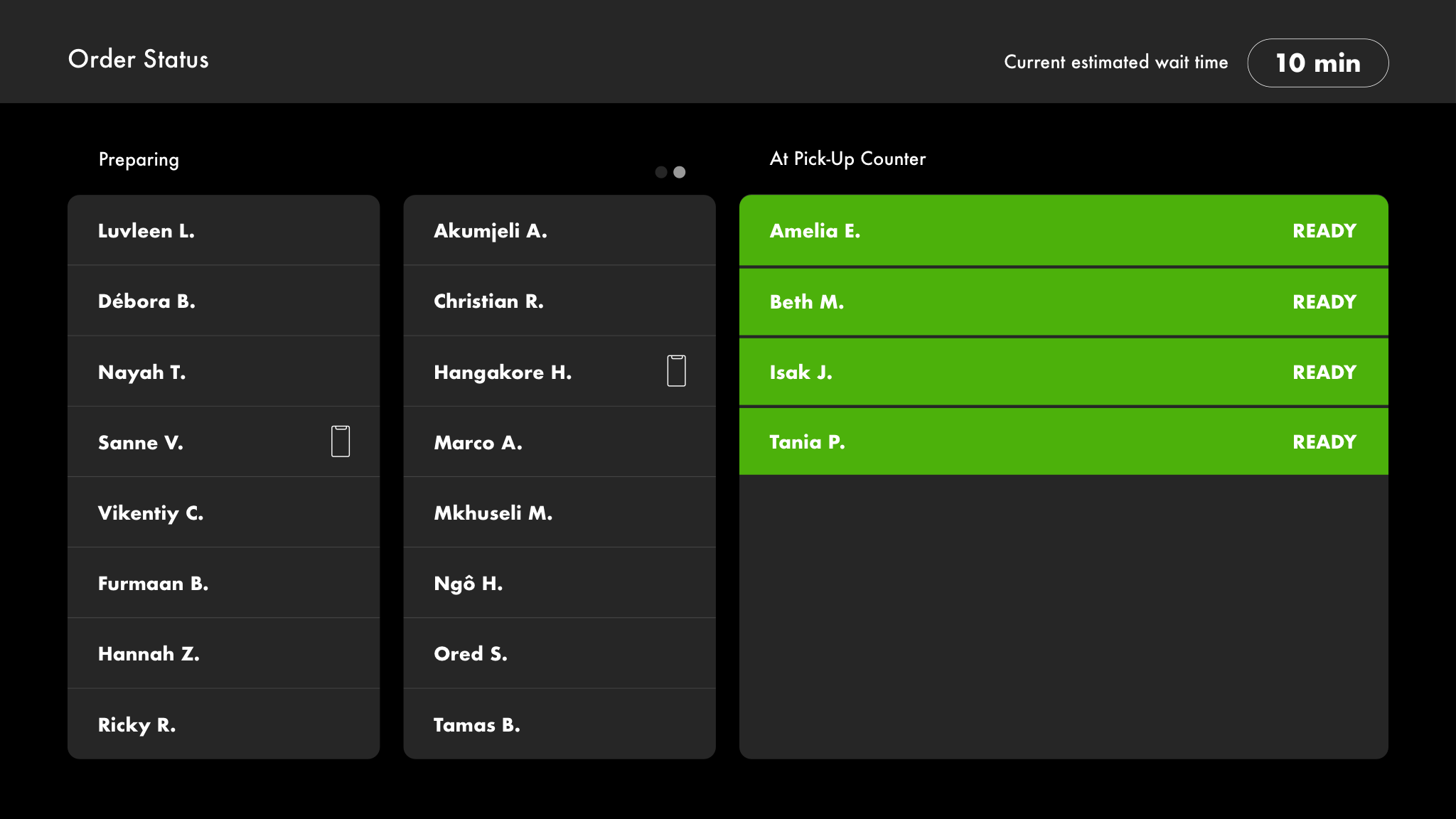
High fidelity design for both regular and rush hours.
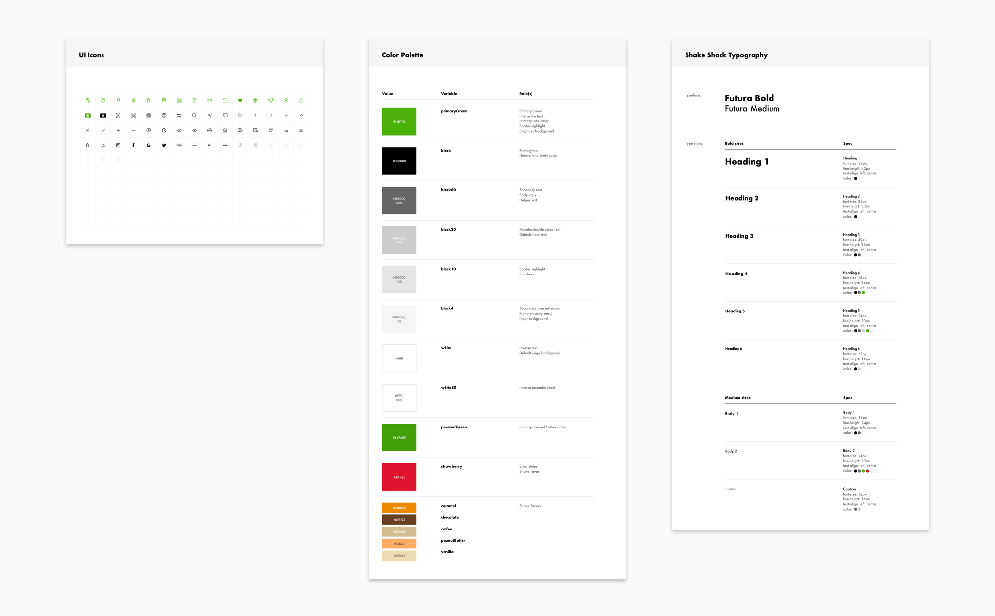
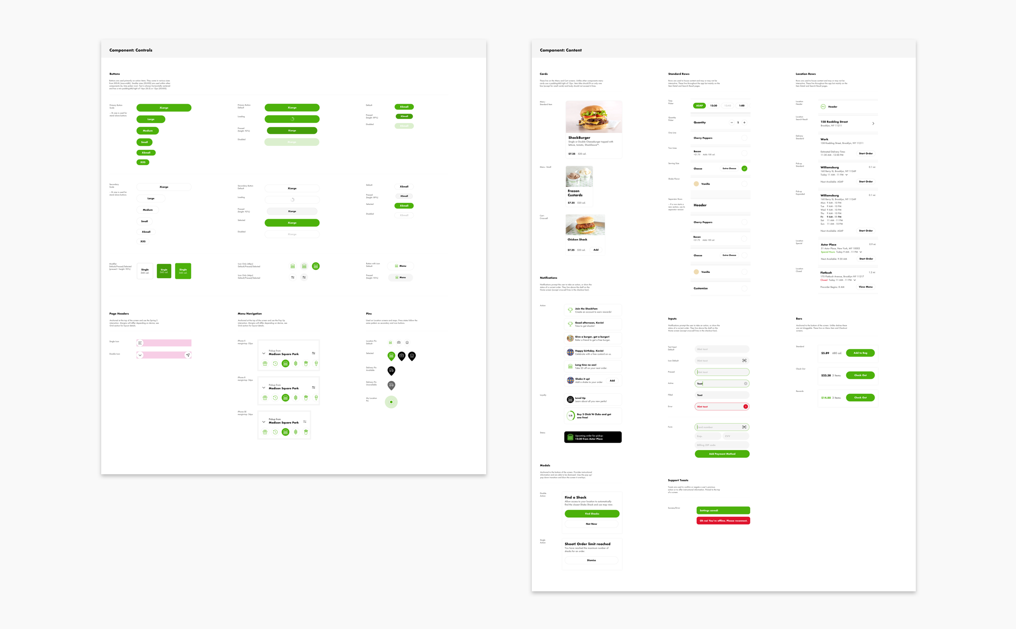
Design System
I lead the initiative to create an evolving design system for Shake Shack’s app experience on iOS. This system was implemented to expedite the design process and to foster design and development collaboration.
Deliverables for the system included a sketch sticker sheet to outline the different elements for design and a Zeplin project for handoff to development.